About Project
Pizza Hut Canada relied on a legacy system that made updating menu prices slow and highly manual. Franchise and operational teams needed one centralized platform to manage products across multiple stores and sales channels.
As the lead product designer, I adapted Pizza Hut’s foundational US store management platform by adding new Canada specefic requirements and features. These features consisted of mutli channel pricing, multi store bulk editing, multi user editing, pricing guardrails across products and more.
The Problem
The previous menu management platform required users to manually maintain prices through an outdated and legacy interface. Which was inefficient and time consuming when coordinating changes across multiple restaurants, menu items, and franchise groups.
Canada also needed greater pricing flexibility. Instead of maintaining a single price, users needed to manage separate in store, online, and aggregator pricing across products, bundles, promotions, and modifiers.
The challenge was to increase operational flexibility without increasing user confusion or usability.
My Role
I led the product design work from requirements through first designs, to product launch, to post launch new feature development.
I partnered with product leadership and a Canadian store manager to translate business requirements into scalable and usable workflows, define role based functionality, and account for key edge cases.
Once the designs were approved, I worked closely with a development team to support implementation and launch. After release, I continued evolving the platform through new features and usability improvements.

1) Designed a scalable multi-channel pricing model
The legacy platform supported a single price per menu item. Canada needed separate in store, online, and aggregator pricing across products, bundles, promotions, and modifiers.
Rather than designing each area independently, I created one reusable pricing pattern that could scale across tables, detail pages, and product types.
✦ Design principle
Create one clear system, then apply it consistently across the product.
This gave menu managers a predictable way to manage channel-specific pricing without relearning the interaction in every section.


2) Designed a role-based permission model
Admin and franchise users needed to work within the same platform, but with different levels of access, control, and responsibility.
I first mapped the complete administrative workflow, then defined which functions, states, and controls should be available to each role. The result was one system with permission based variations rather than separate experiences built independently.
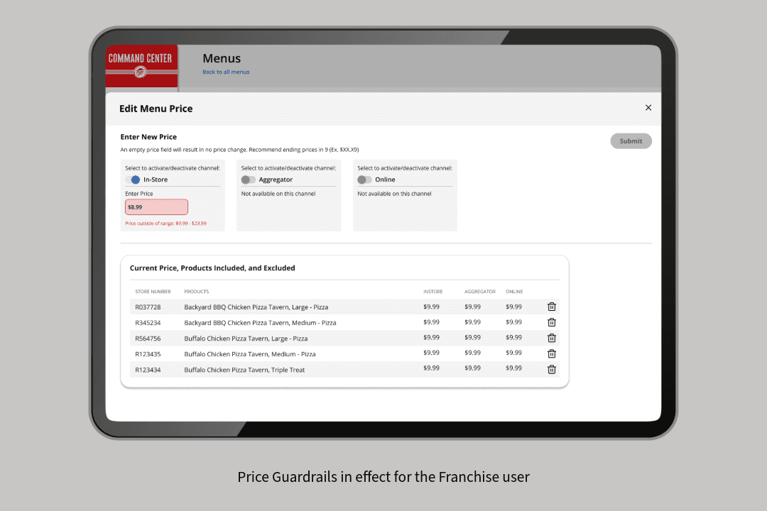
Admins could configure pricing guardrails, channel availability, lock states, and product visibility. Franchise users could then make updates within those defined boundaries.
✦ Design principle
Start with the complete system, then progressively tailor access by role and responsibility.
This approach reduced duplicated design logic, kept interactions consistent across user types, and preserved admin governance without overwhelming franchise users.
IMAGES: guard rails - price error states

3) Made bulk updates efficient & trustworthy
Users needed to make changes across multiple stores, products, and menu items at once. Because one action could affect a large portion of the network, I designed the workflow to clearly show what would change, confirm the result, and preserve a record of the update.
✦ Design principle
The greater the impact of an action, the clearer its scope and outcome should be.
This gave users the speed of bulk editing while helping them feel confident that their changes were applied accurately.
IMG:
The experience included:
selection counts
affected-item summaries
warnings and disabled states
confirmation messaging
update receipts and change history

4) Making a complex system feel familar
As the platform continues to grow with new features, bulk actions, and role based states. Without consistent patterns, the experience could quickly become confusing and difficult to learn.
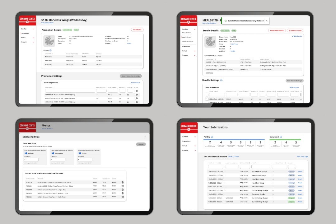
I used the existing design system as a foundation all while referencing Material Design for established guidance to introduce new components and interactions into the system.
Before handoff, I reviewed and tested key interactions with the product and development team to validate usability and ensure new patterns behaved consistently across the product.
✦ Design principle
Reuse established patterns first, then introduce new behaviors only when necessary.
This kept the platform familiar and consistent, helping users move between workflows without relearning the experience.
IMAGE: of the design system and mention the reference of material design system best practices.
Outcome
Command Center launched as the new menu management platform for Pizza Hut Canada’s operational and franchise teams.
Post launch research was conducted with 16 active users. 12 participants or 75% rated the core workflow to be easy to use. Users also reported that the platform simplified menu updates and reduced the time required to manage pricing across stores and channels.
The platform remains active and continues to evolve through new features and operational improvements.
Reflection
This project strengthened my ability to work through complex enterprise and administrative business logic.
I approached the complexity by breaking the platform into reusable patterns, clear role based behaviors, and consistent interactions that could scale across the product.
My contribution was turning a complex operational system into a more structured, predictable, and usable experience. One that users could navigate with greater speed and confidence.