


AKQA Project Overview:
My role was User Experience Designer. I worked with a cross-functional team of project managers, creative directors, art directors, strategists, designers, copyrighter, analysts, developers, and more to create a new web and app experience.
Overall Project Process:
Articulated the UX journey map for web and mobile experience
Design low-fidelity to high-fidelity wireframes
Worked with researcher and strategist on content strategy
Design for all breakpoints
UX annotations for handoff and approval
1) Designing UX for Web & App
Cross-collaborating across the team, we designed the UX for web and app experiences. We brought our ideas to life by mocking up low-fi wireframes that were later put in hi-fidelity using an application-wide design system for both web and app.
User research and data analysis were conducted, which influenced the design decisions made by the team.
All stages of the user journey were ideated and defined at this stage, from content strategy to emails to error states and everything in between. This was a lengthy process to ensure we were getting everything in the experience across the web and app experience.
Flows and screens that were designed out:
Sign-up flow (error states)
Authenticated states for whole web experiences
Homepage and location-specific homepage states
Upgrade account payment flow
Marketing pages
Upselling opportunities
Linked cards flow (error states)
Interactive toast notifications
Receipt capturing flow
Receipt scan status pages
The item list and detail pages
Filter components
Redemption flows
Unsubscribing flows
History pages
Account settings
Footer pages
Account Menu
Interaction design
Accessibility was prioritized
Interactive prototypes were built to explore and present our design to receive feedback from the team on how our design functions.
Close communication was had with the development team to ensure our design would not cause any constraints on their end. In addition, we focused on reusing components to ease development building pressure.


2) Responsive Design
Once the initial UX was built, breakpoints were defined for the web experience. Wireframes were built out on desktop, large tablet, small tablet, and mobile. App wireframes were also designed separately, considering both IOS and Andriod interface functionality.


3) Design Sprints & UX Annotations
A series of sprints were put into place lasting over ten weeks, grouping a series of wireframes and screens to prepare UX wireframes for handoff to development. UX responsibilities here were to lay out the wireframes and write annotations, user flows diagrams, etc. Ensuring that development received everything it needed.
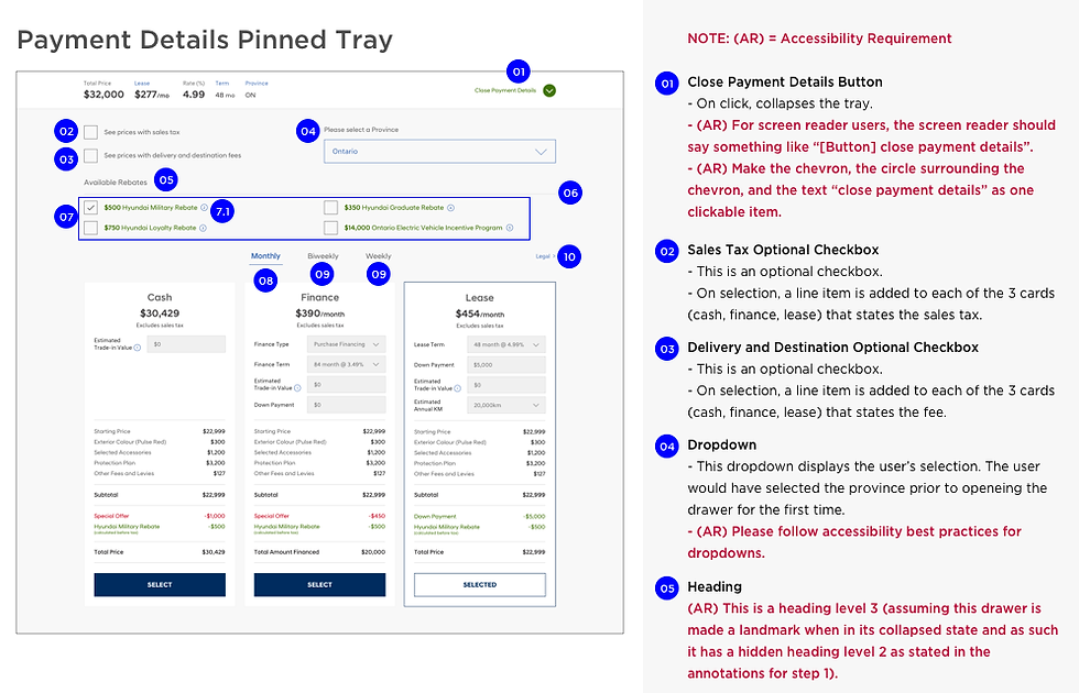
(this is an image of a similar annotations process)
4) Design handoffs and development
The web and app experience is currently in development.

