About Project
Tanger Outlets partnered with AKQA to redesign its digital membership experience across a responsive web and native mobile app. The work focused on creating a more connected journey for shoppers, including account creation, store based content, membership, receipt capture, rewards redemption, account settings, and ongoing engagement.
TL;DR — My Contribution
As a UX Designer, I helped define and design key flows across the experience, including sign-up, authenticated states, membership upgrades, receipt scanning, redemption, history, filters, account settings, and responsive behavior. My work included journey mapping, low- to high-fidelity wireframes, app screen design, prototyping, UX annotations, and development handoff.
The Challenge
Tanger’s new digital-first membership experience needed to support a wide range of behaviors across web and app, so I focused on three priorities:
1. Make membership actions easier to understand and complete
Create a consistent experience across responsive web and native app
Provide development-ready UX documentation for a large set of flows and states
Designing the UX Journey
We began by mapping the core membership journey across the web and app. This included defining how users would sign up, authenticate, upgrade their membership, capture receipts, redeem rewards, manage account details, and interact with location/store specific content.
Using our design system, I defined page structure, user flows, system states, and interaction patterns before the experience moved into high-fidelity design. Research, data analysis, and content strategy, which helped inform key decisions across the journey.
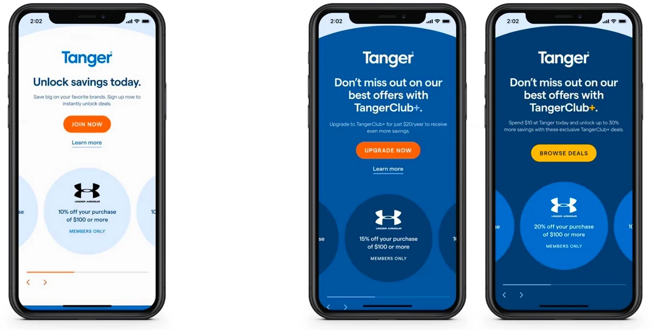
Key Experiences To Design For
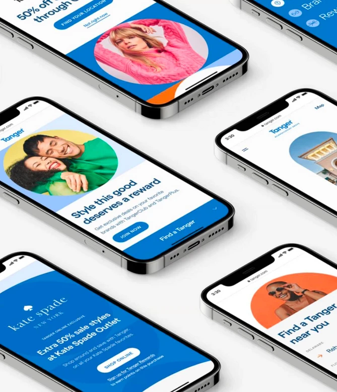
Account Access: Sign-up, error states, authenticated states, account menu, account settings
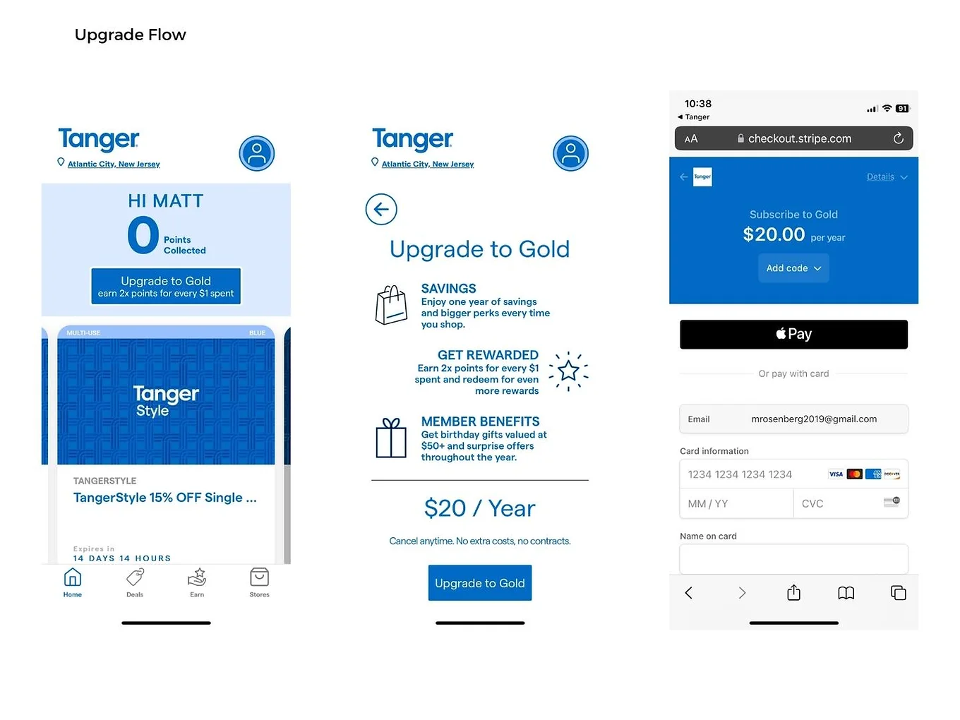
Membership Growth: Upgrade account payment flow, marketing pages, upsell opportunities
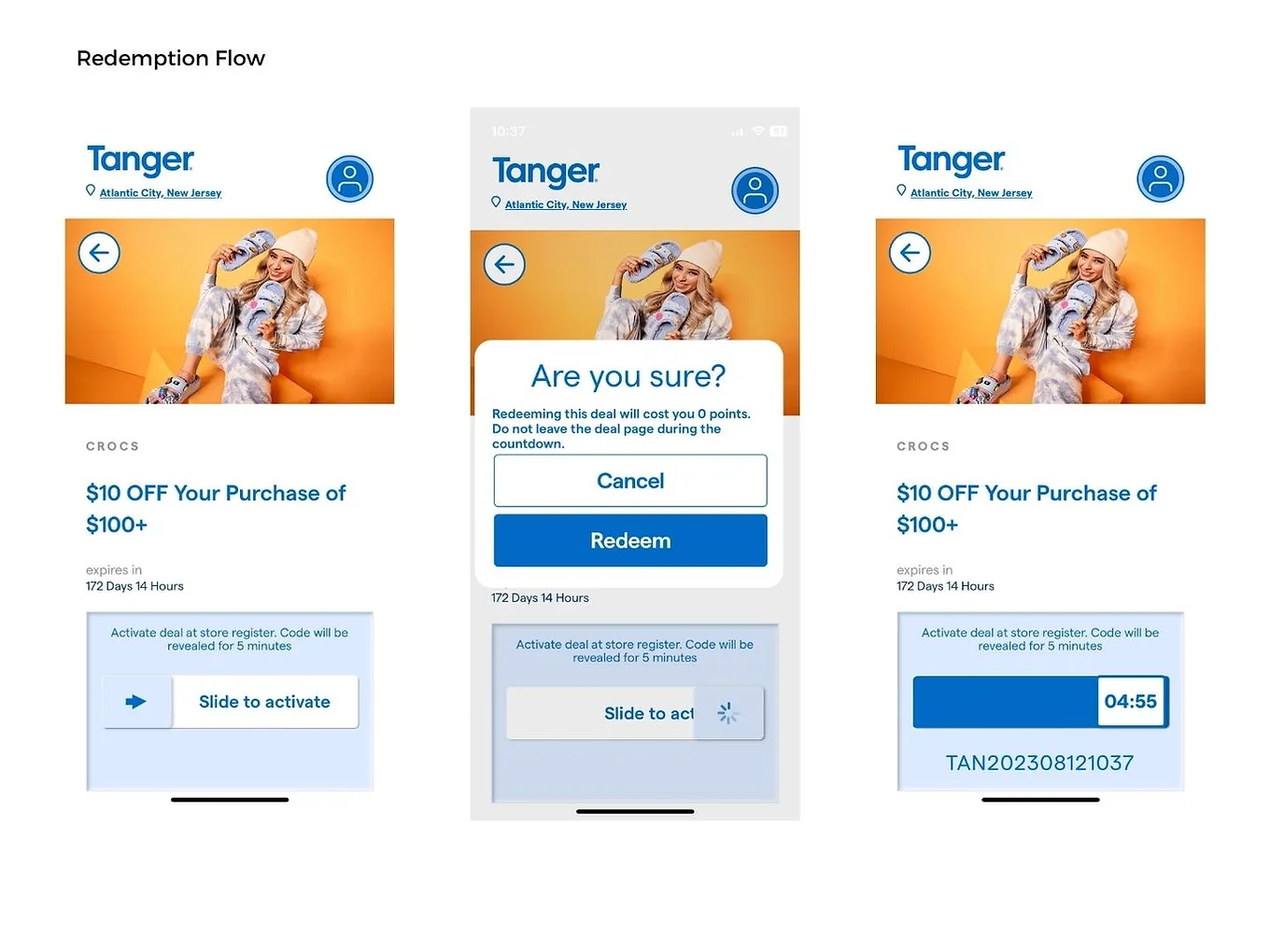
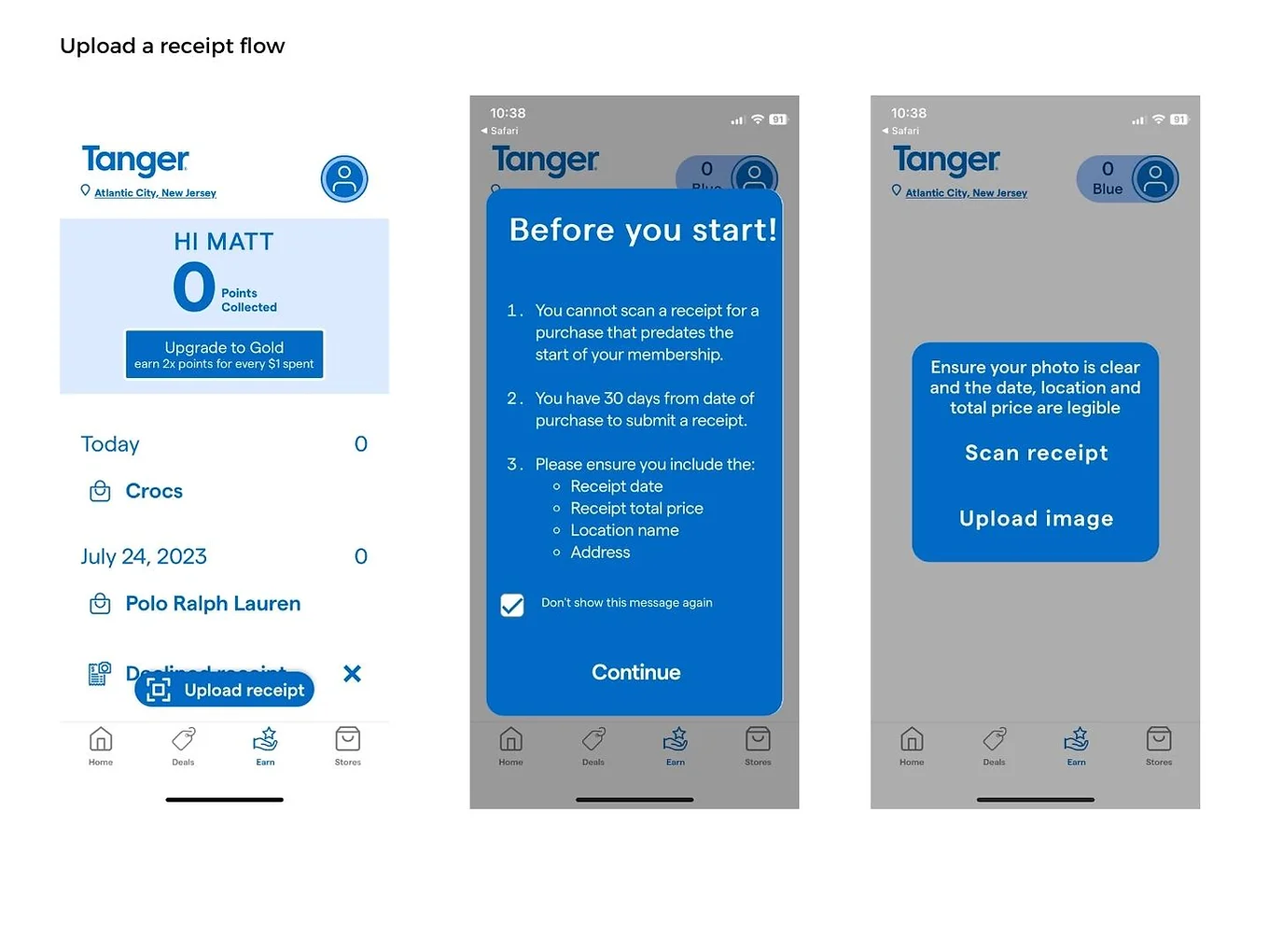
Rewards & Redemption: Receipt capture, receipt scan status, item list/detail pages, redemption flows, history pages
Location-Based Shopping: Homepage states, location-specific homepage states, filters
System Feedback: Linked cards flow, toast notifications, validation/error states, unsubscribe flows
Platform Consistency: Responsive web breakpoints, iOS and Android app considerations, accessibility
Responsive Web + App Design
After the initial UX structure was defined, I helped translate the experience across desktop, large tablet, small tablet, and mobile breakpoints. The native app experience was designed separately to account for iOS and Android interaction patterns, navigation expectations, and platform-specific constraints.
This ensured the membership experience felt consistent across platforms while still respecting the behavior and limitations of each device context.
Design Sprints & UX Annotations
The work was organized into design sprints over a ten-week period, with screens and flows grouped for review, approval, and development handoff. I wrote detailed UX annotations and documentation to reduce interpretation gaps during development.
Reflection
This project strengthened my ability to design within a large, cross-functional product and creative environment. The complexity wasn’t limited to individual screens it came from connecting many membership behaviors into one cohesive experience across web and mobile, authenticated states, responsive breakpoints, and implementation constraints.
The biggest takeaway was the importance of designing the system around the full customer journey. Features like receipt capture, rewards redemption, account upgrades, and location-specific content only work well when they feel connected, predictable, and easy to navigate.